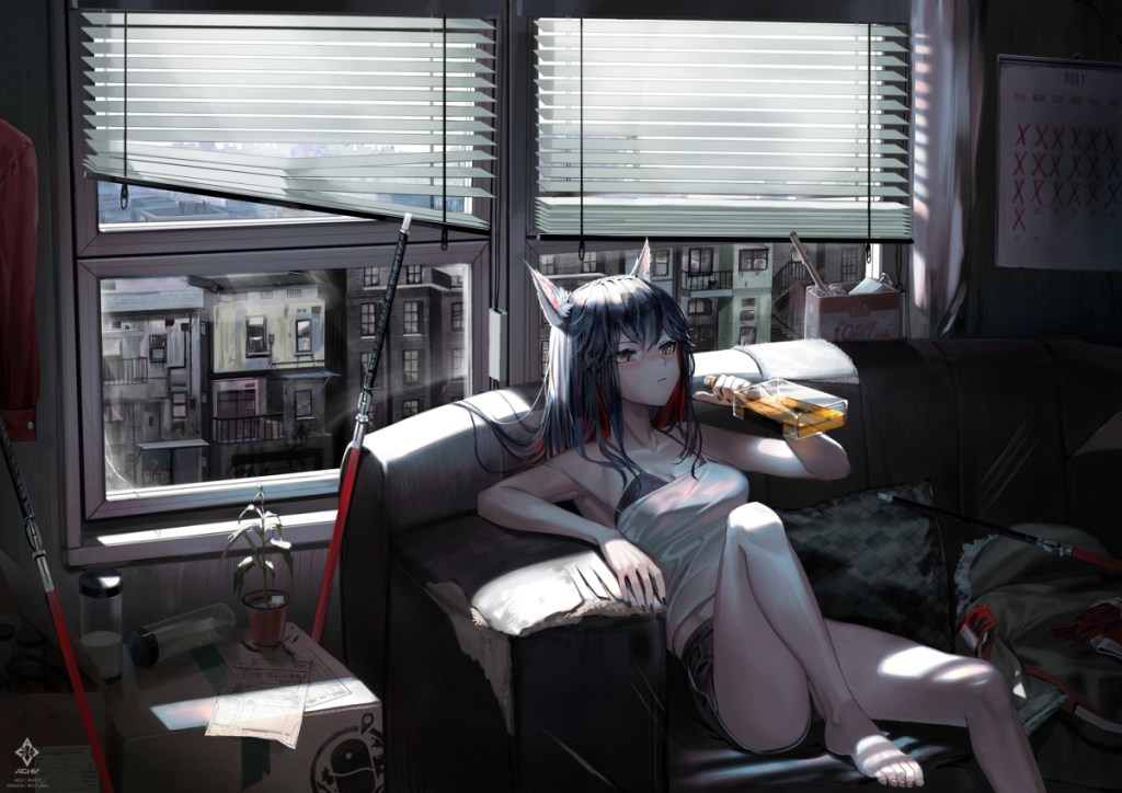
“02:51 P.M. TEXAS” by Team.ACHV
Striking A Balance Between Realism and Stylization
[Saturday, August 14th, 2021] Note: The reason I initially took this down was because it was a sample for the prototype of this blog, and I wanted to make sure I had the permission of the artists first. Permission was granted, and they requested that I link to all of their socials and pages, so I will link those here: Pixiv, YouTube, Twitter and I added a link to where I got the art, to the caption of the image per their request as well. Now enter the article…
Stumbling across this art while I surfed through Pixiv in my usual partially mesmerized fashion, I knew right away this was something I wanted to study. I’m still a relatively new artist, still developing a style, figuring out how to place characters in 3d space, and make the scene and characters work together, and this piece really sates my appetite for drawings that invoke a mood.
The thing that I think makes this piece really stand out is the natural and excellent blend of realism and stylization. While in stylized art there can sometimes be an aversion to representing the environment as too realistic, in my sense the best pieces find a way to use the language of real life within a more imaginative framework. For instance if we take notice of how Texas is drawn we can see that she has nearly the level of detail of a real person, while maintaining the simplicity and beloved anime style in areas such as the hands and face. Just behind her we can see the blinds play with light from likely the sun hitting them, and expertly convey their shape, while letting us barely make out what lies beyond them in the distance. Texas’ ears have lots of small details such as fine hairs fraying in the light, which shows the attentiveness of the artists, while reminding us the picture is fantasy.
Another area tangential to shape and making the environment feel real, is the use of contrast and light and dark. Although nearly all polished compositions use light and dark, this piece emphasizes darkness to set a gloomier mood. Whether we’re looking at the space off to the rightmost end of the picture where areas of heavy black give the impression of lightlessness, or in-between the buildings outside the window, where we also see lots of black to emphasize depth, and sort of the overcast weather, the picture uses contrast to great effect. Notice also, since the string on the inside of the window has less light hitting it, we use a much darker tone to show that it’s in front and really make it stand out. Additionally, another hint of realism can be seen with the wrinkles in Texas’ shirt. They have plenty of detail and the color choices make it appear as if the sky is being reflected off her top giving it almost a dreamy look and it too achieves this, in part, with light and darkness.
Finally, this picture does an incredible job of setting the mood through the aforementioned things, but it also conveys the personality or mood of Texas really well. Looking around the room, we see swords laying all over the place, she has a good ol’ bottle in hand, and we can see tons of red X’s on the calendar to the right. The piece tells a story with the imagery that Texas is probably a bit of a bored warrior with little action on a dreary afternoon. I’m not particularly familiar with Arknights so I can’t comment on her canon personality, but this piece sort of gives that vibe. Looking at it, I feel like I’m there, or can at least resonate with the feelings I think this picture invokes. Many works can be very aesthetically pleasing, but it’s a different thing entirely to create work that stirs certain emotions in people and really makes you feel like you’re there. Great job Team.ACHV, this is definitely one for the bookmarks.

Leave a comment