[commissioned piece] by 適当緑
Hello everyone, hope you’ve been well. Apologies for the lack of uploads the past few weeks, but we are back with yet another amazing work. Opting to go for quality rather than quantity, expect that sometimes uploads may not always be consistent. Instead, AnimeExplicated looks to deliver content that is not only useful and entertaining, but invites you into a new world or level of understanding. For today, we have a work by the wonderful artist “Tekito Midori” or 適当緑 whom can be found on Pixiv via the links in the caption.
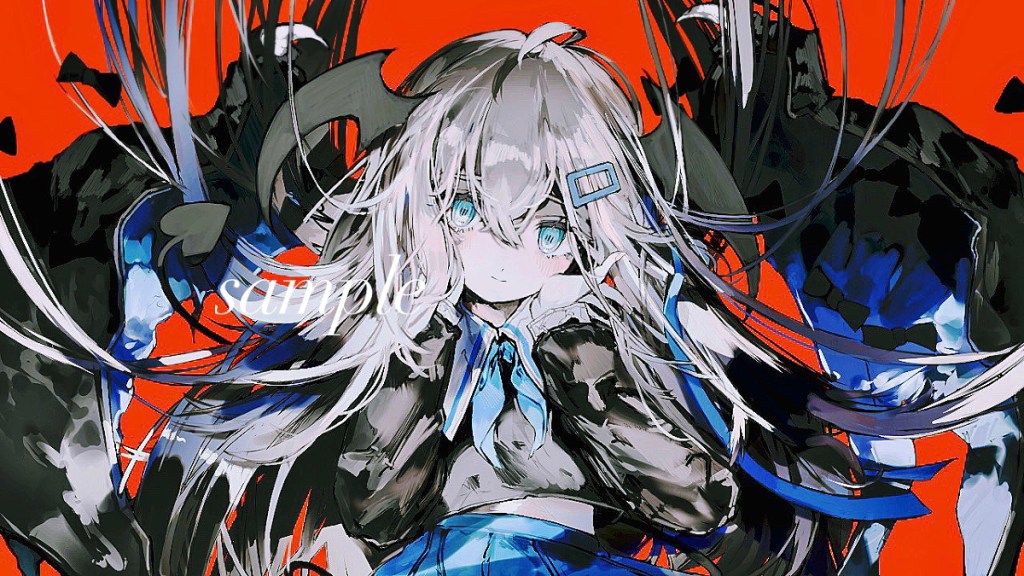
Since there is a lot to talk about here, I’ll start with some of the first elements that I notice. One thing that really popped out at me initially about Midori’s style is her color sense. Her pieces tend to use not only a fair amount of contrast and juxtaposition, which I’ll delve further into in a moment, but she also often uses a rather eclectic array of colors. Right away with the red of the background, the blues and blacks of her wings and clothing, or the silvers and blacks of her hair, the eyes get guided around the painting.
The next thing I’d like to point out is something I really love about Midori’s style. Her unique way of painting in sort of layered splotches is really beautiful, and makes the colors and forms stand out in a really interesting way. You can see what I mean shown off fairly well by looking at this character’s wings. Layers of light blue and white on top of darker blues and blacks convey literally a sky of detail. I wanna focus on the conveyance of detail for a moment longer. A super interesting concept that is part of what I really enjoy about our artist’s style is that the layering effect creates a sort of “illusion of detail.” While of course detail is actually present and this piece clearly has a ton put into it, through certain motions, strokes and simple techniques we can create scenery or information by allowing the brain to fill in the gaps. When I glance or look more intently at the wings and many of the blues in this piece, it looks to me almost as if the sky is being reflected in them. Just like a cloud can be interpreted as many different shapes or things this technique of suggestion adds a really interesting dimension of story to this painting.
I could probably spend hours going on about the nuances of her color sense and painting style, but I’d now like to move to character representation and point of view. There are a couple of subtle choices that make this piece powerful and present some of the effects that it has. Firstly the selection of the canvas orientation and perspective/POV. The choice to make the perspective a more zoomed in, straight on landscape oriented painting is very meaningful for a number of reasons in my mind. One, the orientation of elements allows the character to take over all aspects of the picture, forcing you to focus on very specific elements. The image has a more subtle distinction between background and foreground, where you begin to notice the background slowly as you look around the periphery of the piece. The first things you probably notice are the character’s face, the schoolgirl uniform and the red, because they are sort of coming at you. Next you start to pay attention to the back of her hair, her wings, and demon characteristics. Another nice touch is the motion included in this painting. Looking at the top of her hair, it’s moving up to suggest that she had perhaps been moving quickly downward, or that it’s being suspended by some energy. Touches like these help make the piece more interesting and memorable, in part because they leave you pondering what the character is doing and about the story behind the piece.
Lastly, because I promised I would, I’d like to touch on the element of juxtaposition that I mentioned. Just as we can have contrast between colors we can have a similar effect created relating to concepts and elements. As I kind of tease in the title, the juxtaposition in this piece comes from the harmlessness and innocence of the school girl and her human appearance, mixed with her demonic features. Of course, we would normally associate some level of danger or mischief with demons, but that ordinary concern is somewhat displaced by how cute the character is. If her appearance wasn’t enough, the feeling of adorableness is amplified by the bows seemingly floating around the piece. All in all, I think this piece is an excellent showcasing of some of Midori’s superpowers around painting style, character orientation and her mastery in making various powerful colors work together to make amazing paintings.

Leave a comment