piece by “コムノ/Ningen❸” aka Comuno
Hello everyone, hope this post finds you doing well. For today’s review we will be covering one of many incredible and complex works by the artist “Comuno.” As per usual the links to their Pixiv can be found in the caption under the image. The piece did not have a particular title stated anywhere so I may simply refer to it as “dye” for ease of reference.
Though we’ve certainly approached some pieces with a fair amount of nuance and things to analyze, I wanna branch out and cover lots of different styles and techniques to really get a varied and more comprehensive coverage of all things anime art. One of the things that really stands out to me about Comuno’s art, is that they have so many layers and details to what they do, that the piece changes depending on your level of analysis. If you zoom in on certain areas of their paintings you will get a completely different feel of the effects than if you appreciate the works from a distance. Additionally, the combination of certain elements in a few of this artist’s pieces create a really interesting collage-y feel at times that I really enjoy.
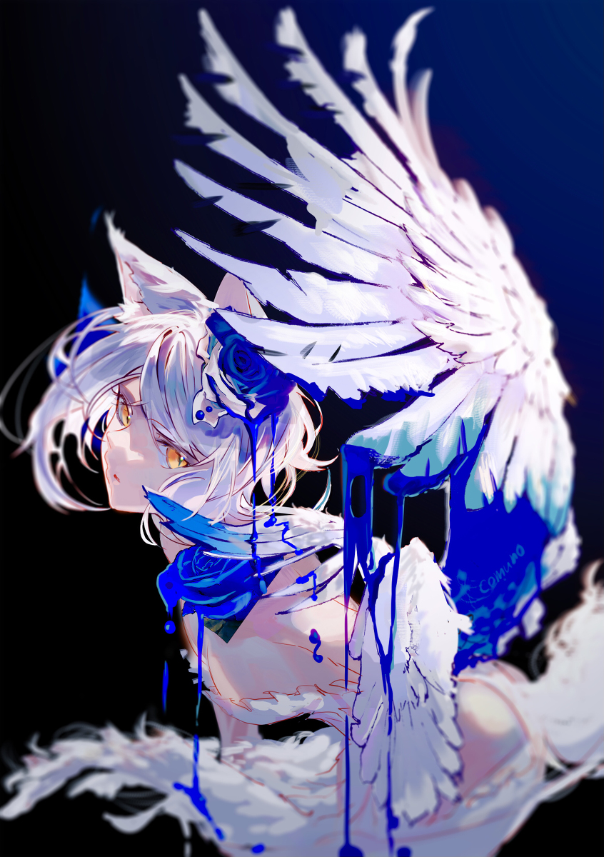
Artist or not, the impact of a silhouette is immense regardless of who views a piece, and Comuno has a really fantastic way of approaching this element of the painting. Rather than simply defining the character space with a thickened line of sorts, Comuno focuses the attention on particular aspects of their paintings with the use of a gradient blurring effect. While their implementation is a high-level digital one, this concept of going from blurry to sharp applies to any art medium. If you look at the very top of the image, you notice the tips of the wing start to blur and likewise we notice a very strong blur effect at the bottom of the piece. Not only does this work to establish a potential background and foreground to the image, or layers of depth, but it brings our attention to the sharper parts of the image.
Playing around with sharpness is far from the only thing that our artist does here. Comuno, in a highly unique way, uses sharpness, light manipulation and changes in saturation (very much so in this piece) to establish the way the eye moves over the painting. Notice an almost translucent bright color on the back of the wings and top of the hair, and hues that radiate outward. In part, this suggests some form of light source, but it’s yet another place where playing with the saturation and sharpness makes the image very eye-catching. Overall, there is a really nice luminescent highlight effect this image has that really elevates it to the next level. Not to gloss over it, the position of the character, expression and movement in the hair and clothing are extremely important to help establish the weight of this painting as well.
On another note, notice that certain elements like the wing look like they are right in your face, while the characters head seems a bit further away. Looking at one of the central points of this piece that I have yet to mention, the dye is the most saturated and sharpest point of the image. This is why the work is so interesting to me. The layers of the elements are so distinct that it looks a bit out of place, like a collage, but it makes you extremely drawn in. Not only are the quality of the lines and strokes worth sticking around for, but the painting has hidden details and ways that the elements work together that you don’t notice at a glance. Comuno’s pieces are of the sort where you see and learn something new every time you look at them and that is one huge reason that I think their art is so special. I implore anyone to stop and try to figure out what’s going on, only to have a different thought the next time you look.

Leave a comment